

Pulse Wellness
Branding • Naming • Digital Assets
Pulse Wellness is an Adelaide-based brand bringing together nutrition and personal training under one holistic approach to health. The challenge? Create an identity that felt both energising and grounded, yet clinical enough to inspire trust, human enough to feel approachable.
Naming
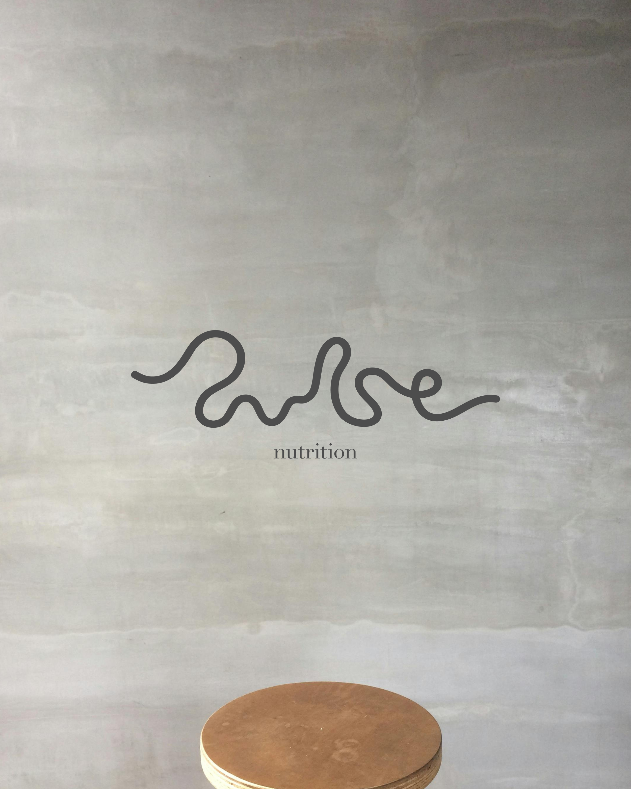
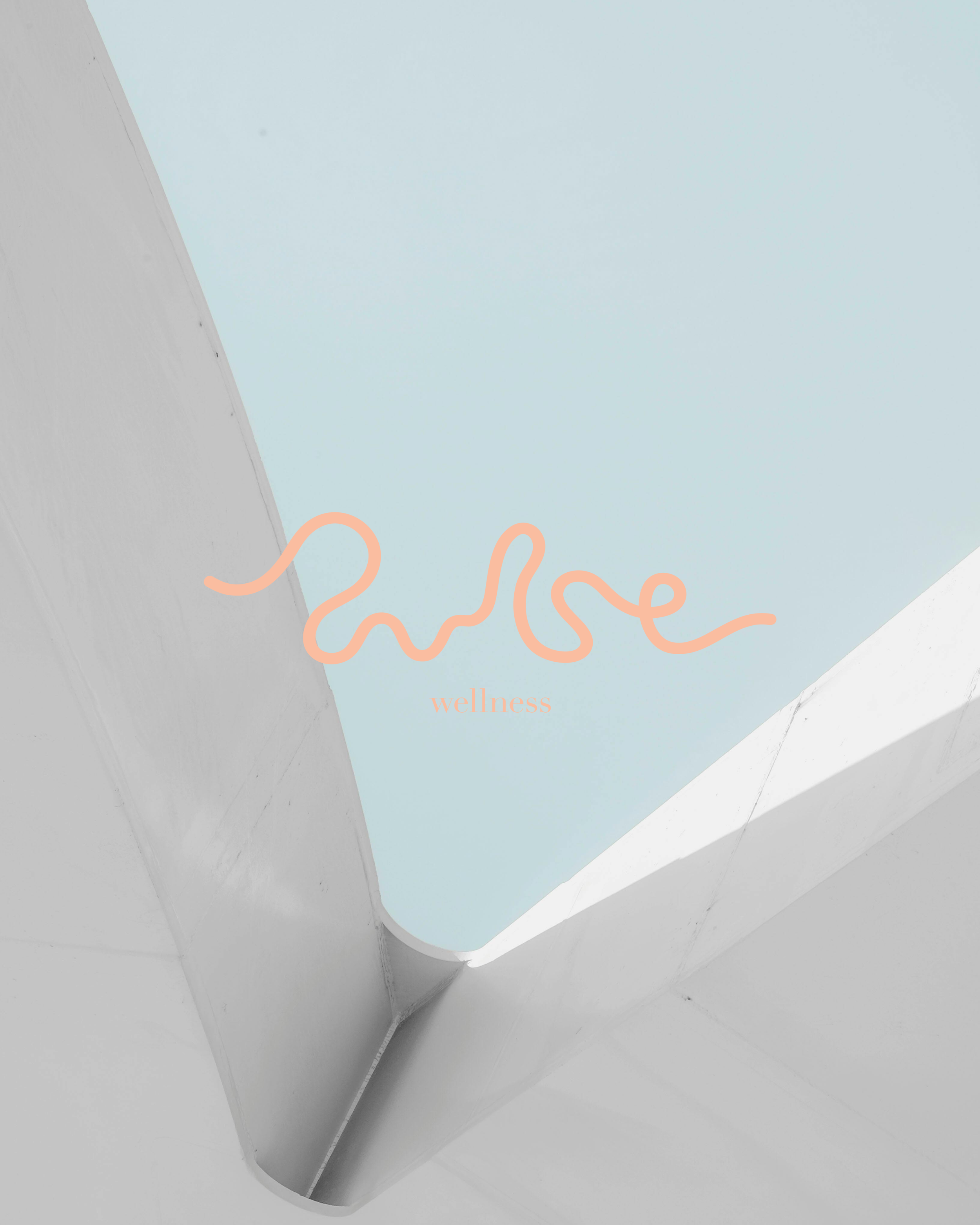
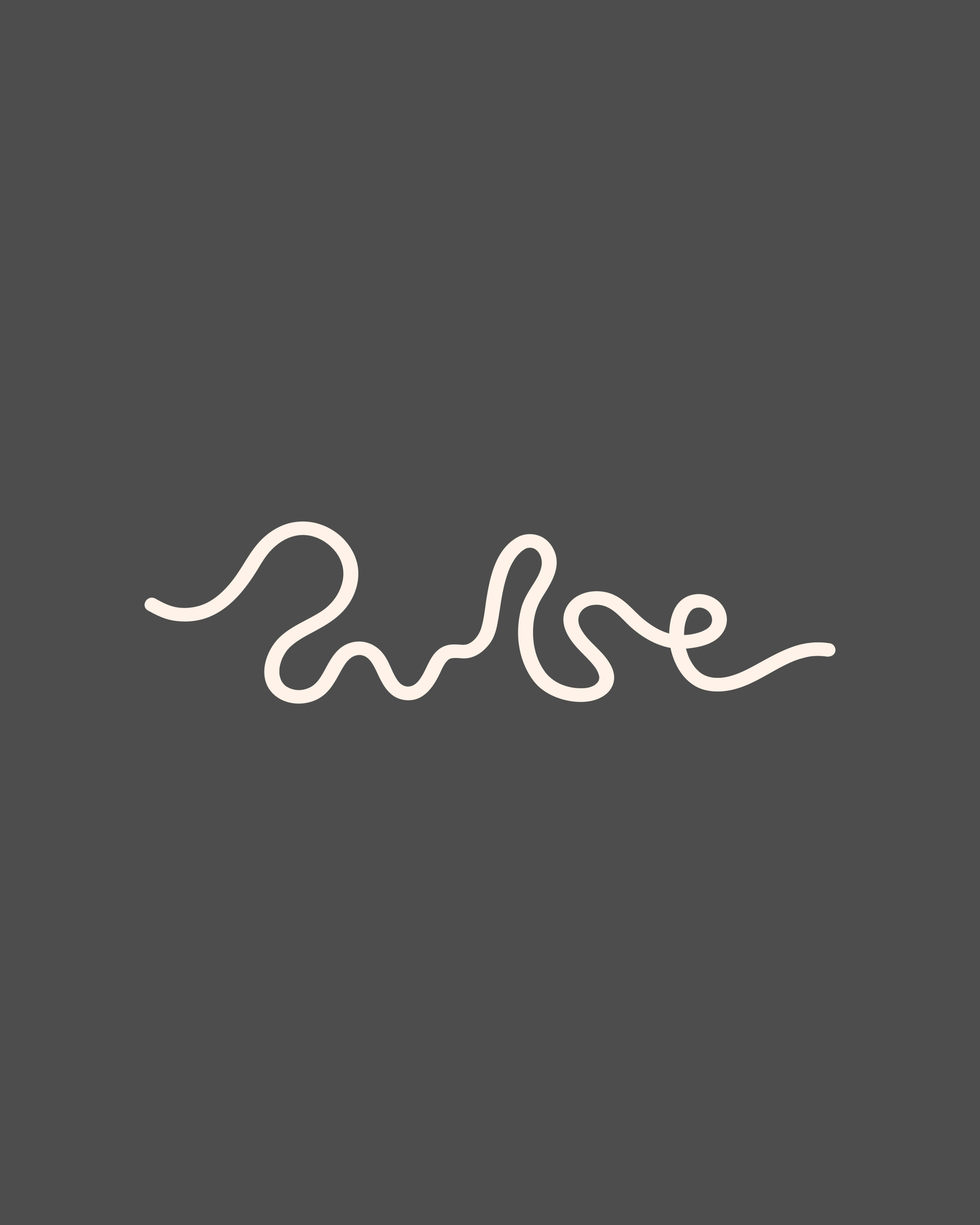
The brand name and visual identity centre around the literal pulse—the heartbeat of every client's wellness journey. The mark itself is a stylised pulse line that flows seamlessly between its sub-brands, Pulse Nutrition and Pulse Move, creating a cohesive system that maintains visual consistency while allowing for distinct personality.

Branding
With a clean, minimal aesthetic and a palette that balances warmth with professionalism, the Pulse identity system was built for versatility. The flowing pulse mark works across contexts; bold enough to stand alone, refined enough to pair with typography. The result is a brand that feels both trustworthy and energetic, reflecting the care and dedication Pulse brings to every client.


Application
A brand identity only works if it translates seamlessly across every touchpoint. From business cards and social media templates to digital assets and promotional materials, the Pulse system was designed to be both flexible and foolproof. Every application maintains the brand's core values; clean, approachable, and unmistakably Pulse. Whether it's showing up in someone's Instagram feed or sitting on a reception desk.